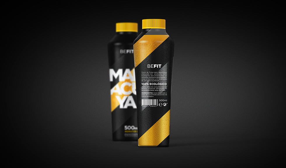
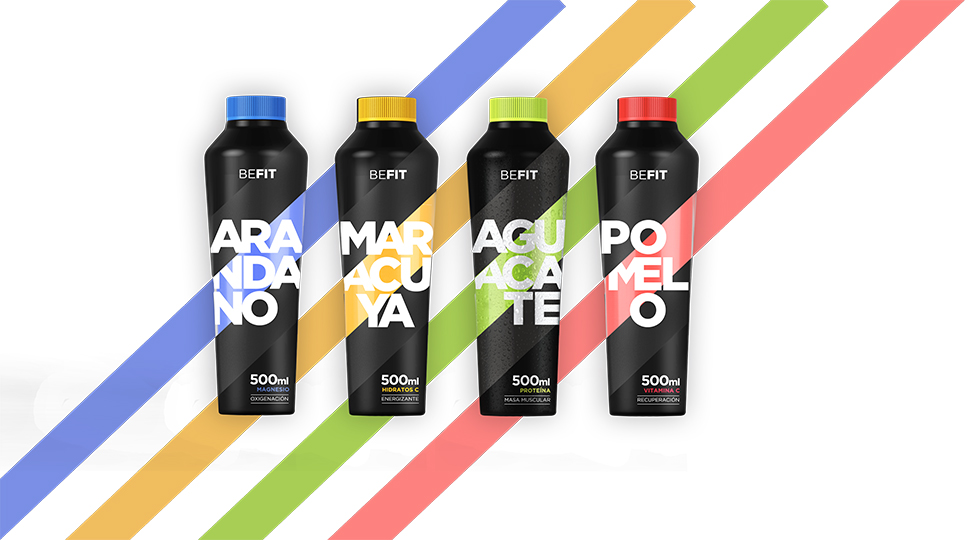
Be Fit
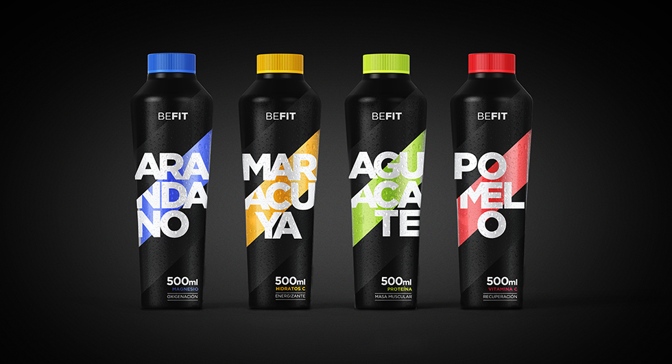
‘Befit’ is the development of the naming and structural and graphic packaging of natural juices for sports people. ‘Befit’ combines the strength, energy and vibrant colour of the flavour of each juice, aiming to merge sports aesthetic with natural fruit.
‘Befit’ has an elegant style that is clearly established in the energy and training drinks sector. Bright colours are indicative of the flavours, while black communicates strength. ‘Befit’ does not include any type of unnecessary graphics or texts, it tells patients that it just does its job and that it gives juice drinkers the energy they need.