Wink
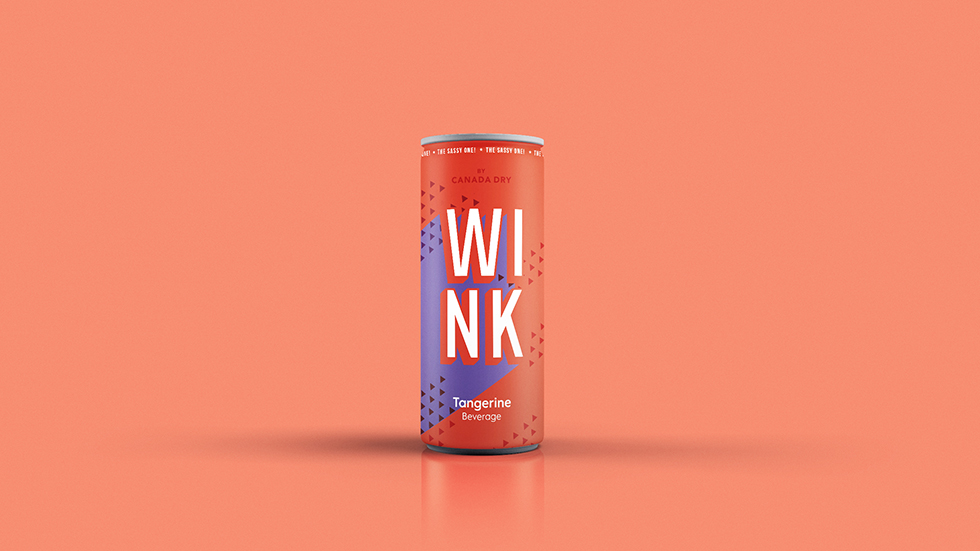
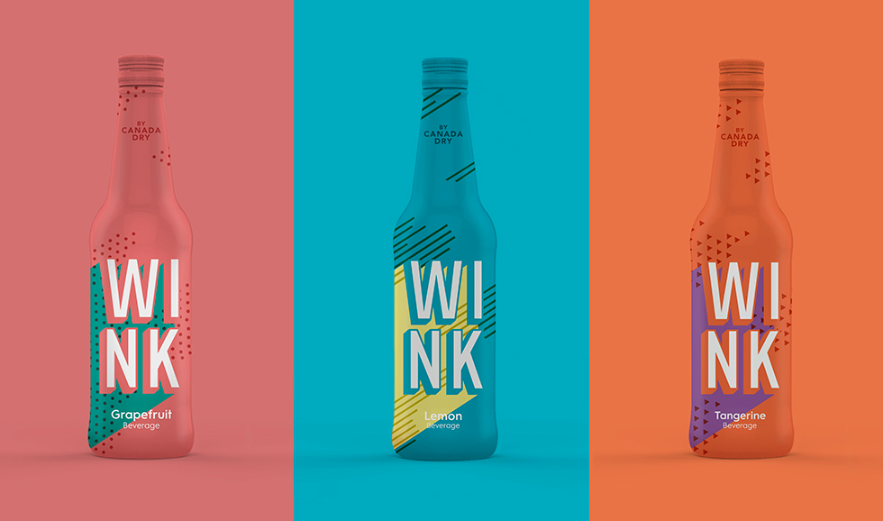
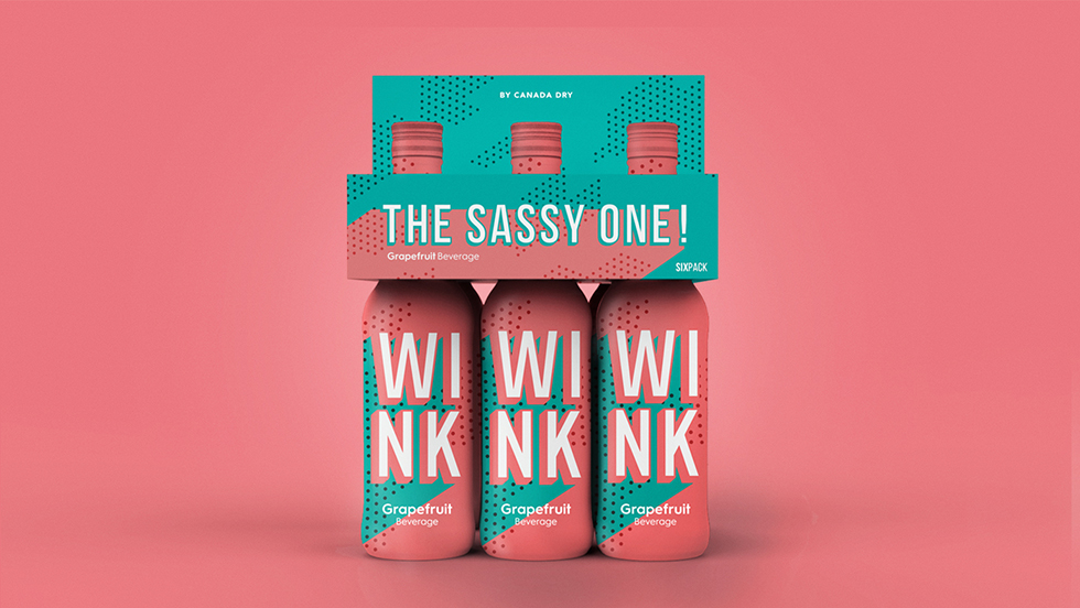
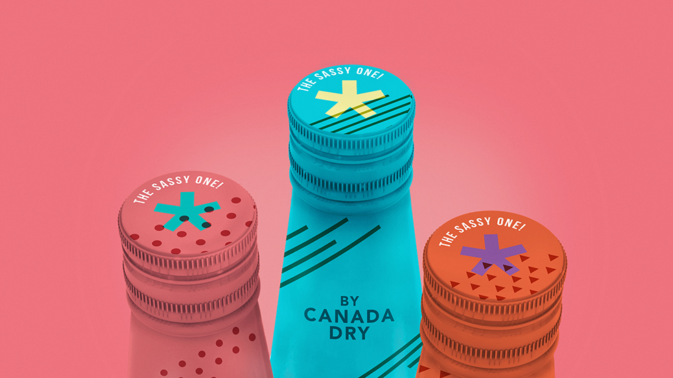
‘Wink’ is a branding and packaging redesign project for Wink sodas, part of the Canada Dry family from the 1960s. A range of three flavours in bottle, can and six-pack format.
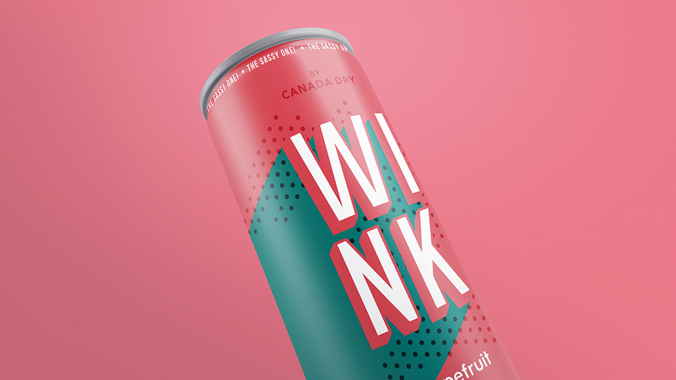
Once we had studied the brand, we felt that the best way to relaunch the brand for a modern young audience was by reviving the spirit and reinventing the 1960s origin trend of pop art, from a time steeped in artistic wealth. We took our inspiration from 1960s fashion, swinging London, graphic patterns, aesthetic references of the cinema and colour palettes.
The aim was to create a soda that would stand out from its current competition, that would use a new language, without using recurring resources such as fruit or splash.
A strong brand due to its visual impact on a supermarket shelf. A visual interplay of shadow that adds energy through chromatic differentiation and superimposing a pattern that simulates 1960s printing errors.